


Auditing LorTush.com
Auditing LorTush.com
Auditing LorTush.com
Trying to make e-commerce WCAG compliant
Trying to make e-commerce WCAG compliant
Trying to make e-commerce WCAG compliant
Accessibility
Accessibility
Accessibility
ADA
ADA
ADA
WCAG 2.2
WCAG 2.2
WCAG 2.2
Automated testing
Automated testing
Automated testing
Usability
Usability
Usability
Screen readers
Screen readers
Screen readers
Semantic HTML
Semantic HTML
Semantic HTML
Cognitive disability
Cognitive disability
Cognitive disability
Where
Where
Where
Baltimore, MD
Baltimore, MD
Baltimore, MD
What
What
What
Website
Website
Website
Website
Why
Why
Why
Increased accessibility
Increased accessibility
Increased accessibility
Increased accessibility
Role
Role
Role
Role
Accessibility + Design
Consultant
Accessibility + Design
Consultant
Accessibility + Design
Consultant
Accessibility + Design
Consultant
Category
Category
Category
Category
E-commerce, Home goods
E-commerce, Home goods
E-commerce, Home goods
E-commerce, Home goods
When
When
When
When
Jan 2024-Feb 2024
Jan 2024-Feb 2024
Jan 2024-Feb 2024
Jan 2024-Feb 2024
Why I worked on this
Why I worked on this
Why I worked on this
I am passionate about accessibility. I came across a friend's e-commerce site with an accessibility statement but also some clear accessibility issues. When I offered to help make it fully accessible, they gladly accepted.
I am passionate about accessibility. I came across a friend's e-commerce site with an accessibility statement but also some clear accessibility issues. When I offered to help make it fully accessible, they gladly accepted.
I am passionate about accessibility. I came across a friend's e-commerce site with an accessibility statement but also some clear accessibility issues. When I offered to help make it fully accessible, they gladly accepted.


Market Research
Market Research
Market Research
The problem
The problem
The problem
There were 4,605 digital accessibility lawsuits filed in 2023- a near 2x increase over 6 years, and 84% of defendants were e-commerce businesses. These lawsuits don’t only indicate legal action, but are a way of identifying essential user needs
There were 4,605 digital accessibility lawsuits filed in 2023- a near 2x increase over 6 years, and 84% of defendants were e-commerce businesses. These lawsuits don’t only indicate legal action, but are a way of identifying essential user needs
There were 4,605 digital accessibility lawsuits filed in 2023- a near 2x increase over 6 years, and 84% of defendants were e-commerce businesses. These lawsuits don’t only indicate legal action, but are a way of identifying essential user needs
The claim
The claim
The claim
E-commerce businesses have a unique expectation of accessibility from their users, making it imperative that LorTush.com provide an accessible experience
E-commerce businesses have a unique expectation of accessibility from their users, making it imperative that LorTush.com provide an accessible experience
E-commerce businesses have a unique expectation of accessibility from their users, making it imperative that LorTush.com provide an accessible experience
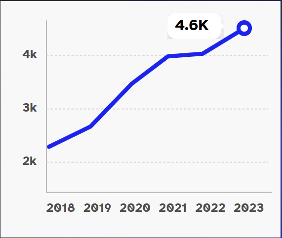
Number of cases from 2018-2023
Number of cases from 2018-2023
Number of cases from 2018-2023
Source: UsableNet Midyear Report
Source: UsableNet Midyear Report
Source: UsableNet Midyear Report
The product
The product
The product
Lor Tush is an e-commerce business based in Baltimore, MD that sells sustainable bamboo toilet paper, and is focused on making a positive impact both locally and globally.
Lor Tush is an e-commerce business based in Baltimore, MD that sells sustainable bamboo toilet paper, and is focused on making a positive impact both locally and globally.
Lor Tush is an e-commerce business based in Baltimore, MD that sells sustainable bamboo toilet paper, and is focused on making a positive impact both locally and globally.

The accessibility statement
The accessibility statement
The accessibility statement
(found in footer)
(found in footer)
(found in footer)
(found in footer)
“Lor Tush is committed to making our website's content accessible and user friendly to everyone. If you are having difficulty viewing or navigating the content on this website, or notice any content, feature, or functionality that you believe is not fully accessible to people with disabilities, please email our team at cs@lortush.com with "Disabled Access" in the subject line and provide a description of the specific feature you feel is not fully accessible or a suggestion for improvement. We take your feedback seriously and will consider it as we evaluate ways to accommodate all of our customers and our overall accessibility policies. Additionally, while we do not control such vendors, we strongly encourage vendors of third-party digital content to provide content that is accessible and user friendly.”
“Lor Tush is committed to making our website's content accessible and user friendly to everyone. If you are having difficulty viewing or navigating the content on this website, or notice any content, feature, or functionality that you believe is not fully accessible to people with disabilities, please email our team at cs@lortush.com with "Disabled Access" in the subject line and provide a description of the specific feature you feel is not fully accessible or a suggestion for improvement. We take your feedback seriously and will consider it as we evaluate ways to accommodate all of our customers and our overall accessibility policies. Additionally, while we do not control such vendors, we strongly encourage vendors of third-party digital content to provide content that is accessible and user friendly.”
“Lor Tush is committed to making our website's content accessible and user friendly to everyone. If you are having difficulty viewing or navigating the content on this website, or notice any content, feature, or functionality that you believe is not fully accessible to people with disabilities, please email our team at cs@lortush.com with "Disabled Access" in the subject line and provide a description of the specific feature you feel is not fully accessible or a suggestion for improvement. We take your feedback seriously and will consider it as we evaluate ways to accommodate all of our customers and our overall accessibility policies. Additionally, while we do not control such vendors, we strongly encourage vendors of third-party digital content to provide content that is accessible and user friendly.”
The website
The website
The website
WARNING: FLASHING IMAGES
WARNING: FLASHING IMAGES
WARNING: FLASHING IMAGES
Immediate observations
Immediate observations
Immediate observations
Upon casually visiting the site, the animation was the first thing I noticed. All animation found on the site is a failure of Level A WCAG success criteria 2.2.2, which specifies the amount of animation allowed before accessibility is impacted- which I will elaborate on later.
Upon casually visiting the site, the animation was the first thing I noticed. All animation found on the site is a failure of Level A WCAG success criteria 2.2.2, which specifies the amount of animation allowed before accessibility is impacted- which I will elaborate on later.
Upon casually visiting the site, the animation was the first thing I noticed. All animation found on the site is a failure of Level A WCAG success criteria 2.2.2, which specifies the amount of animation allowed before accessibility is impacted- which I will elaborate on later.
What was perhaps more troubling, and this goes beyond WCAG compliance, was the speed of the flashing of the colorful toilet paper images. According to criteria 2.3.1, another level A success criteria, any flashing content must not exceed 3 flashes/second. Based on my crude calculation, this content flashed about 2.25 times/second. This could still cause a seizure for an epileptic, especially considering all of the other motion occurring simultaneously.
What was perhaps more troubling, and this goes beyond WCAG compliance, was the speed of the flashing of the colorful toilet paper images. According to criteria 2.3.1, another level A success criteria, any flashing content must not exceed 3 flashes/second. Based on my crude calculation, this content flashed about 2.25 times/second. This could still cause a seizure for an epileptic, especially considering all of the other motion occurring simultaneously.
What was perhaps more troubling, and this goes beyond WCAG compliance, was the speed of the flashing of the colorful toilet paper images. According to criteria 2.3.1, another level A success criteria, any flashing content must not exceed 3 flashes/second. Based on my crude calculation, this content flashed about 2.25 times/second. This could still cause a seizure for an epileptic, especially considering all of the other motion occurring simultaneously.
These success criteria can impact those with a wide variety of disabilities. This much motion can be problematic for users with AD/HD, autism spectrum disorder, dyslexia, epilepsy, anxiety, and migraines. There is also the general usability issue of not being able to read the navigation menu over the video background.
These success criteria can impact those with a wide variety of disabilities. This much motion can be problematic for users with AD/HD, autism spectrum disorder, dyslexia, epilepsy, anxiety, and migraines. There is also the general usability issue of not being able to read the navigation menu over the video background.
These success criteria can impact those with a wide variety of disabilities. This much motion can be problematic for users with AD/HD, autism spectrum disorder, dyslexia, epilepsy, anxiety, and migraines. There is also the general usability issue of not being able to read the navigation menu over the video background.
For blind users, these animations present their own set of issues, which I will address later.
For blind users, these animations present their own set of issues, which I will address later.
For blind users, these animations present their own set of issues, which I will address later.

The proposition
The proposition
The proposition
After noticing these problems, I approached the co-founder of Lor Tush and told her that I was IAAP-certified and could properly audit the website for WCAG issues as well as assist in remediation, given my UX design background. They were excited to create a better experience for their users- so we moved forward with an accessibility audit.
After noticing these problems, I approached the co-founder of Lor Tush and told her that I was IAAP-certified and could properly audit the website for WCAG issues as well as assist in remediation, given my UX design background. They were excited to create a better experience for their users- so we moved forward with an accessibility audit.
After noticing these problems, I approached the co-founder of Lor Tush and told her that I was IAAP-certified and could properly audit the website for WCAG issues as well as assist in remediation, given my UX design background. They were excited to create a better experience for their users- so we moved forward with an accessibility audit.

Credit: Kim Hairston/The Baltimore Sun
Credit: Kim Hairston/The Baltimore Sun
Credit: Kim Hairston/The Baltimore Sun
Audit scope
Audit scope
Audit scope
WCAG version
WCAG version
WCAG version
2.2
2.2
2.2
Website scope
Website scope
Website scope
Essential web content located at lortush.com that may require access in order to make a purchase
Essential web content located at lortush.com that may require access in order to make a purchase
Essential web content located at lortush.com that may require access in order to make a purchase
Additional requirements
Additional requirements
Additional requirements
The report will include a list of all issues identified by the evaluator, as well as a summary of findings
The report will include a list of all issues identified by the evaluator, as well as a summary of findings
The report will include a list of all issues identified by the evaluator, as well as a summary of findings
Conformance target
Conformance target
Conformance target
AA
AA
AA
Support baseline
Support baseline
Support baseline
MacBook with VoiceOver, Chrome with keyboard navigation and NVDA, AXE Devtools, WAVE, Stark
MacBook with VoiceOver, Chrome with keyboard navigation and NVDA, AXE Devtools, WAVE, Stark
MacBook with VoiceOver, Chrome with keyboard navigation and NVDA, AXE Devtools, WAVE, Stark
Web technology
Web technology
Web technology
HTML, CSS, WAI-ARIA, JavaScript
HTML, CSS, WAI-ARIA, JavaScript
HTML, CSS, WAI-ARIA, JavaScript
Numerical results
Numerical results
Numerical results
Reported on 55 of 55 WCAG 2.2 AA Success Criteria
Reported on 55 of 55 WCAG 2.2 AA Success Criteria
Reported on 55 of 55 WCAG 2.2 AA Success Criteria

18
18
18
Failed
Failed
Failed
Failed
28
28
28
Passed
Passed
Passed
Passed
1
1
1
Cannot tell
Cannot tell
Cannot tell
Cannot tell
8
8
8
Not present
Not present
Not present
Not present
10 failed level A success criteria (most critical)
10 failed level A success criteria (most critical)
10 failed level A success criteria (most critical)
8 failed level AA success criteria
8 failed level AA success criteria
8 failed level AA success criteria
Beyond the issues related to motion, the majority of WCAG Level A non-compliances were attributed to substandard coding practices. In the defense of the client, this is largely due to the use of a no-code platform (Shopify) to build the site and the use of a theme that was developed before Shopify implemented new rules regarding accessibility requirements and guidelines for all new theme submissions. Essential aspects of accessibility like semantic HTML, meaningful sequence and hierarchy went entirely ignored due to how the platform functions, which is partially why LorTush.com is difficult/impossible to navigate for blind users specifically.
Beyond the issues related to motion, the majority of WCAG Level A non-compliances were attributed to substandard coding practices. In the defense of the client, this is largely due to the use of a no-code platform (Shopify) to build the site and the use of a theme that was developed before Shopify implemented new rules regarding accessibility requirements and guidelines for all new theme submissions. Essential aspects of accessibility like semantic HTML, meaningful sequence and hierarchy went entirely ignored due to how the platform functions, which is partially why LorTush.com is difficult/impossible to navigate for blind users specifically.
Beyond the issues related to motion, the majority of WCAG Level A non-compliances were attributed to substandard coding practices. In the defense of the client, this is largely due to the use of a no-code platform (Shopify) to build the site and the use of a theme that was developed before Shopify implemented new rules regarding accessibility requirements and guidelines for all new theme submissions. Essential aspects of accessibility like semantic HTML, meaningful sequence and hierarchy went entirely ignored due to how the platform functions, which is partially why LorTush.com is difficult/impossible to navigate for blind users specifically.
A large portion of websites being built today are built with no-code solutions, so for this reason it is critical that no-code products continue to bake-in accessibility features, but it is equally essential that users of those products have a basic understanding of accessibility in order for these features to be utilized and effective.
A large portion of websites being built today are built with no-code solutions, so for this reason it is critical that no-code products continue to bake-in accessibility features, but it is equally essential that users of those products have a basic understanding of accessibility in order for these features to be utilized and effective.
A large portion of websites being built today are built with no-code solutions, so for this reason it is critical that no-code products continue to bake-in accessibility features, but it is equally essential that users of those products have a basic understanding of accessibility in order for these features to be utilized and effective.
Here are some examples of the most critical success criteria failures I came across, and how they might be fixed...
Here are some examples of the most critical success criteria failures I came across, and how they might be fixed...
Here are some examples of the most critical success criteria failures I came across, and how they might be fixed...
Perceivable WCAG criteria
Perceivable WCAG criteria
Perceivable WCAG criteria
Essential failures
Essential failures
Essential failures
1.3.1: Info and Relationships
1.3.1: Info and Relationships
1.3.1: Info and Relationships
1.3.2: Meaningful Sequence
1.3.2: Meaningful Sequence
1.3.2: Meaningful Sequence
1.3.1: Info and Relationships
1.3.1: Info and Relationships
1.3.1: Info and Relationships
WCAG criterion 1.3.1 states that information, structure, and relationships conveyed through presentation can be programmatically determined or are available in text. Meaning that the way in which the content is presented visually must not be the only means of conveying its organization and meaning. Adherence to this criteria is mainly achieved through proper use of semantic HTML, ARIA, and appropriate use of headings. This is meant to assure websites are compatible with the screen readers employed by blind users.
WCAG criterion 1.3.1 states that information, structure, and relationships conveyed through presentation can be programmatically determined or are available in text. Meaning that the way in which the content is presented visually must not be the only means of conveying its organization and meaning. Adherence to this criteria is mainly achieved through proper use of semantic HTML, ARIA, and appropriate use of headings. This is meant to assure websites are compatible with the screen readers employed by blind users.
WCAG criterion 1.3.1 states that information, structure, and relationships conveyed through presentation can be programmatically determined or are available in text. Meaning that the way in which the content is presented visually must not be the only means of conveying its organization and meaning. Adherence to this criteria is mainly achieved through proper use of semantic HTML, ARIA, and appropriate use of headings. This is meant to assure websites are compatible with the screen readers employed by blind users.
Here is a visual representation of the use of headings on the homepage thanks to AXE DevTools:
Here is a visual representation of the use of headings on the homepage thanks to AXE DevTools:
Here is a visual representation of the use of headings on the homepage thanks to AXE DevTools:
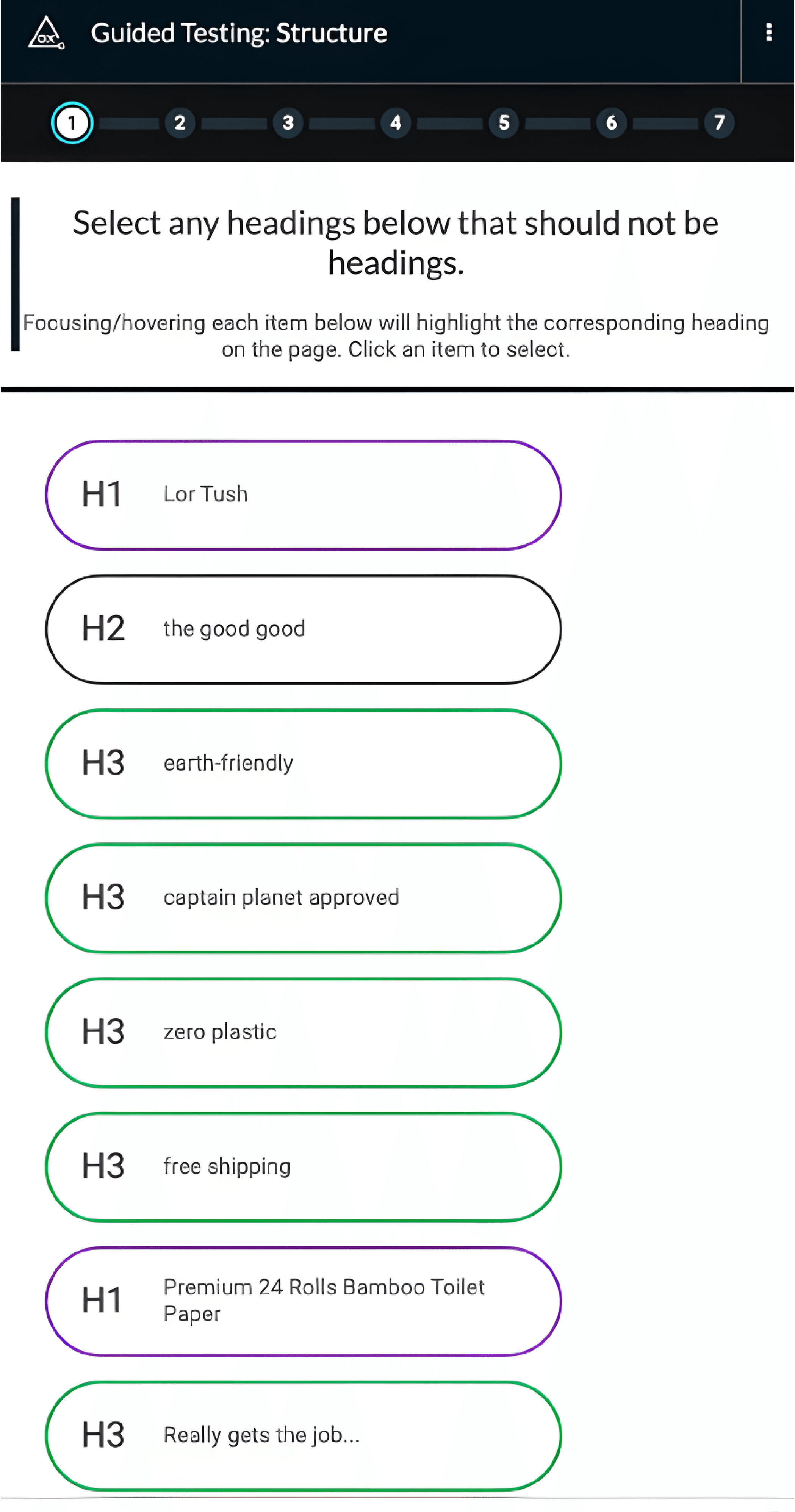
Above are a number of headings with titles which are not clearly descriptive, and some also should not be headings at all. This occurred because headings were being used for the sake of style rather than structure (17 headings on home page). For this reason, the order of items might seem sensical enough for the sighted user, but the blind user with a screen reader may be met with a confusing delivery of information that makes the website inaccessible for some, due to how screen readers handle headings and how information is prioritized.
Above are a number of headings with titles which are not clearly descriptive, and some also should not be headings at all. This occurred because headings were being used for the sake of style rather than structure (17 headings on home page). For this reason, the order of items might seem sensical enough for the sighted user, but the blind user with a screen reader may be met with a confusing delivery of information that makes the website inaccessible for some, due to how screen readers handle headings and how information is prioritized.
Above are a number of headings with titles which are not clearly descriptive, and some also should not be headings at all. This occurred because headings were being used for the sake of style rather than structure (17 headings on home page). For this reason, the order of items might seem sensical enough for the sighted user, but the blind user with a screen reader may be met with a confusing delivery of information that makes the website inaccessible for some, due to how screen readers handle headings and how information is prioritized.
To add to the issue, outside of headers, the website ignores the practice of semantic HTML- which in short means using semantically meaningful HTML markdowns such as <nav>,<main>,<article> , or <section> rather than relying mostly upon generic <div> blocks or <span> elements, which provide screen readers with very little information. Headers are currently the only semantically meaningful markdowns being used on this website.
To add to the issue, outside of headers, the website ignores the practice of semantic HTML- which in short means using semantically meaningful HTML markdowns such as <nav>,<main>,<article> , or <section> rather than relying mostly upon generic <div> blocks or <span> elements, which provide screen readers with very little information. Headers are currently the only semantically meaningful markdowns being used on this website.
To add to the issue, outside of headers, the website ignores the practice of semantic HTML- which in short means using semantically meaningful HTML markdowns such as <nav>,<main>,<article> , or <section> rather than relying mostly upon generic <div> blocks or <span> elements, which provide screen readers with very little information. Headers are currently the only semantically meaningful markdowns being used on this website.
Here is how the code is currently written for a section on the home page which highlights a specific product...
Here is how the code is currently written for a section on the home page which highlights a specific product...
Here is how the code is currently written for a section on the home page which highlights a specific product...

Due to the lack of semantic HTML above, the screen readers I use (VoiceOver, NVDA) don’t actually read the descriptive text. In fact, they read none of the longer descriptive text on the site, including the item descriptions on individual product pages.
Due to the lack of semantic HTML above, the screen readers I use (VoiceOver, NVDA) don’t actually read the descriptive text. In fact, they read none of the longer descriptive text on the site, including the item descriptions on individual product pages.
Due to the lack of semantic HTML above, the screen readers I use (VoiceOver, NVDA) don’t actually read the descriptive text. In fact, they read none of the longer descriptive text on the site, including the item descriptions on individual product pages.
Solution
Solution
Solution
This can be solved simply by adding some semantic information to the code. In this case I just wrap the description in a <p> (paragraph) tag such as below in order for screen readers to understand and read the code to users.
This can be solved simply by adding some semantic information to the code. In this case I just wrap the description in a <p> (paragraph) tag such as below in order for screen readers to understand and read the code to users.
This can be solved simply by adding some semantic information to the code. In this case I just wrap the description in a <p> (paragraph) tag such as below in order for screen readers to understand and read the code to users.

1.3.2: Meaningful Sequence
1.3.2: Meaningful Sequence
1.3.2: Meaningful Sequence
This success criterion shares a lot with the previously mentioned 1.3.1. Both of these criteria primarily deal with assuring that code can be properly interpreted by screen readers. The main difference between the two being that this one focuses specifically on how the code impacts the order in which information is read to a blind user when compared with browsing the interface as a sighted user.
This success criterion shares a lot with the previously mentioned 1.3.1. Both of these criteria primarily deal with assuring that code can be properly interpreted by screen readers. The main difference between the two being that this one focuses specifically on how the code impacts the order in which information is read to a blind user when compared with browsing the interface as a sighted user.
This success criterion shares a lot with the previously mentioned 1.3.1. Both of these criteria primarily deal with assuring that code can be properly interpreted by screen readers. The main difference between the two being that this one focuses specifically on how the code impacts the order in which information is read to a blind user when compared with browsing the interface as a sighted user.
Testing this requires the use of two different screen readers to be sure many blind users are represented in my testing. I used VoiceOver and NVDA again. The order of elements came out somewhat sensibly using VoiceOver, with the exception of the missing product descriptions. Using this website with NVDA (a much more popular screen reader) was, however, much more difficult. Here’s the transcript of what NVDA reads out loud to me until about halfway navigating through the Home Page:
Testing this requires the use of two different screen readers to be sure many blind users are represented in my testing. I used VoiceOver and NVDA again. The order of elements came out somewhat sensibly using VoiceOver, with the exception of the missing product descriptions. Using this website with NVDA (a much more popular screen reader) was, however, much more difficult. Here’s the transcript of what NVDA reads out loud to me until about halfway navigating through the Home Page:
Testing this requires the use of two different screen readers to be sure many blind users are represented in my testing. I used VoiceOver and NVDA again. The order of elements came out somewhat sensibly using VoiceOver, with the exception of the missing product descriptions. Using this website with NVDA (a much more popular screen reader) was, however, much more difficult. Here’s the transcript of what NVDA reads out loud to me until about halfway navigating through the Home Page:
lortush.com selected
lor tush® bamboo toilet paper. wipe on playa, wipe on. – Lor Tush
clickable link Skip to content
complementary landmark Free shipping on all orders!
Primary navigation landmark list with 2 items visited link current page Home
link Shop out of list
heading level 1 visited link graphic Lor Tush
link Log in
button Cart (0)
main landmark 586D4D0B 8D6B 4614 8EA3 6E6E8D46C1EE frame clickable
button Copy link
link Watch on www.youtube.com out of frame
wipe on playa, wipe on. wipe on playa, wipe on. wipe on playa, wipe on.
Watch on www.youtube.com link
buy now → link
lortush.com visited link
lortush.com visited link
lortush.com visited link
lortush.com visited link
Premium 24 Rolls Bamboo Toilet Paper link heading level 1
Add to cart → button
clickable Buy now with ShopPay button
This is a very confusing string of text to be read out loud, and that is due to poor use of sequence/semantic HTML and generally poor code. In reality, if I were a blind user I’d likely give up and spend my money elsewhere before getting past the home page. While accessibility is often viewed through an ethical lens, it also has significant business implications. In the United States there are 3.5 million legally blind adults, and the disabled community as a whole accounts for 26% of the adult population.
This is a very confusing string of text to be read out loud, and that is due to poor use of sequence/semantic HTML and generally poor code. In reality, if I were a blind user I’d likely give up and spend my money elsewhere before getting past the home page. While accessibility is often viewed through an ethical lens, it also has significant business implications. In the United States there are 3.5 million legally blind adults, and the disabled community as a whole accounts for 26% of the adult population.
This is a very confusing string of text to be read out loud, and that is due to poor use of sequence/semantic HTML and generally poor code. In reality, if I were a blind user I’d likely give up and spend my money elsewhere before getting past the home page. While accessibility is often viewed through an ethical lens, it also has significant business implications. In the United States there are 3.5 million legally blind adults, and the disabled community as a whole accounts for 26% of the adult population.
Solution
Solution
Solution
The solution in this situation is much less simple, as what you see above is the sum of many accessibility errors. In short, though, this success criterion could be satisfied by better use of semantic HTML and proper use of headings throughout the website.
The solution in this situation is much less simple, as what you see above is the sum of many accessibility errors. In short, though, this success criterion could be satisfied by better use of semantic HTML and proper use of headings throughout the website.
The solution in this situation is much less simple, as what you see above is the sum of many accessibility errors. In short, though, this success criterion could be satisfied by better use of semantic HTML and proper use of headings throughout the website.
Every success criterion that a website/app fails to meet should be seen as a lost opportunity to engage with a substantial group of potential users.
Every success criterion that a website/app fails to meet should be seen as a lost opportunity to engage with a substantial group of potential users.
Every success criterion that a website/app fails to meet should be seen as a lost opportunity to engage with a substantial group of potential users.


Operable WCAG criteria
Operable WCAG criteria
Operable WCAG criteria
Essential failures
Essential failures
Essential failures
2.2.2: Pause, Stop, Hide
2.2.2: Pause, Stop, Hide
2.2.2: Pause, Stop, Hide
2.4.7: Focus Visible
2.4.7: Focus Visible
2.4.7: Focus Visible
2.2.2: Pause, Stop, Hide
2.2.2: Pause, Stop, Hide
2.2.2: Pause, Stop, Hide
This criterion is interesting in that it affects the disabled and the abled alike, and can create usability and accessibility issues simultaneously. Mentioned earlier, criterion 2.2.2 states that any moving, blinking, or scrolling information that starts automatically, lasts over 5 seconds, and is presented with other content must have a way for the user to pause, stop, or hide it. This homepage has a video background, scrolling text, and quickly flashing images- none of which the user has any control over.
This criterion is interesting in that it affects the disabled and the abled alike, and can create usability and accessibility issues simultaneously. Mentioned earlier, criterion 2.2.2 states that any moving, blinking, or scrolling information that starts automatically, lasts over 5 seconds, and is presented with other content must have a way for the user to pause, stop, or hide it. This homepage has a video background, scrolling text, and quickly flashing images- none of which the user has any control over.
This criterion is interesting in that it affects the disabled and the abled alike, and can create usability and accessibility issues simultaneously. Mentioned earlier, criterion 2.2.2 states that any moving, blinking, or scrolling information that starts automatically, lasts over 5 seconds, and is presented with other content must have a way for the user to pause, stop, or hide it. This homepage has a video background, scrolling text, and quickly flashing images- none of which the user has any control over.
This criterion primarily has users with cognitive and neurological disabilities in mind, with the hope that it will minimize the amount of distracting elements and cognitive load on a website, making it easier to navigate the site. As mentioned earlier- in the case of epileptic users, this extent of animation could even cause a seizure.
This criterion primarily has users with cognitive and neurological disabilities in mind, with the hope that it will minimize the amount of distracting elements and cognitive load on a website, making it easier to navigate the site. As mentioned earlier- in the case of epileptic users, this extent of animation could even cause a seizure.
This criterion primarily has users with cognitive and neurological disabilities in mind, with the hope that it will minimize the amount of distracting elements and cognitive load on a website, making it easier to navigate the site. As mentioned earlier- in the case of epileptic users, this extent of animation could even cause a seizure.
The Pause, Stop, Hide criterion is a great example of the intersection between accessibility and usability. While a failure of this criterion can be extremely frustrating or harmful for a user with AD/HD, Epilepsy, or Dyslexia- this extent of animation also makes for an uncomfortable experience for abled users. According to a Nielsen Norman Group survey- 95% of users felt that some websites contained too much animation, and 77% of users said that animation on websites was either distracting or made no difference to their experience.
The Pause, Stop, Hide criterion is a great example of the intersection between accessibility and usability. While a failure of this criterion can be extremely frustrating or harmful for a user with AD/HD, Epilepsy, or Dyslexia- this extent of animation also makes for an uncomfortable experience for abled users. According to a Nielsen Norman Group survey- 95% of users felt that some websites contained too much animation, and 77% of users said that animation on websites was either distracting or made no difference to their experience.
The Pause, Stop, Hide criterion is a great example of the intersection between accessibility and usability. While a failure of this criterion can be extremely frustrating or harmful for a user with AD/HD, Epilepsy, or Dyslexia- this extent of animation also makes for an uncomfortable experience for abled users. According to a Nielsen Norman Group survey- 95% of users felt that some websites contained too much animation, and 77% of users said that animation on websites was either distracting or made no difference to their experience.
Solution
Solution
Solution
To fix this WCAG failure one can either change the animations in question to static images, shorten the animations, or add a means of pausing or hiding the animation to each animated element.
To fix this WCAG failure one can either change the animations in question to static images, shorten the animations, or add a means of pausing or hiding the animation to each animated element.
To fix this WCAG failure one can either change the animations in question to static images, shorten the animations, or add a means of pausing or hiding the animation to each animated element.
2.4.7: Focus Visible
2.4.7: Focus Visible
2.4.7: Focus Visible
Criterion 2.4.7 is meant to assist users who navigate apps and websites using only a keyboard and no mouse. While navigating a website using only a keyboard, the tab key is used to jump between interactive elements. While doing this, the element that is currently in focus should be highlighted in some fashion, like this example you see below from LorTush.com
Criterion 2.4.7 is meant to assist users who navigate apps and websites using only a keyboard and no mouse. While navigating a website using only a keyboard, the tab key is used to jump between interactive elements. While doing this, the element that is currently in focus should be highlighted in some fashion, like this example you see below from LorTush.com
Criterion 2.4.7 is meant to assist users who navigate apps and websites using only a keyboard and no mouse. While navigating a website using only a keyboard, the tab key is used to jump between interactive elements. While doing this, the element that is currently in focus should be highlighted in some fashion, like this example you see below from LorTush.com
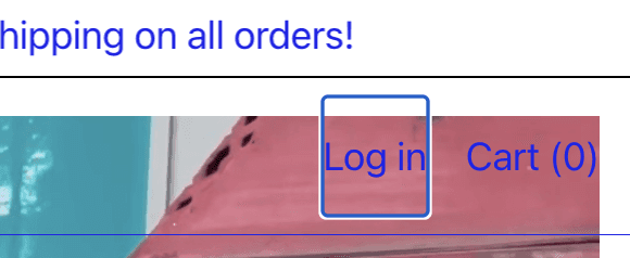
The purpose of the focus indicator is for the user to know what interactive element they are selecting if they hit enter. Keyboard navigation is often employed by users with motor disabilities such as muscular dystrophy, cerebral palsy or carpal tunnel syndrome. This success criterion also helps users with temporary injuries such as broken arms or hands and is in addition utilized by users with low vision, as they may find a keyboard easier to control than a magnified mouse pointer.
The purpose of the focus indicator is for the user to know what interactive element they are selecting if they hit enter. Keyboard navigation is often employed by users with motor disabilities such as muscular dystrophy, cerebral palsy or carpal tunnel syndrome. This success criterion also helps users with temporary injuries such as broken arms or hands and is in addition utilized by users with low vision, as they may find a keyboard easier to control than a magnified mouse pointer.
The purpose of the focus indicator is for the user to know what interactive element they are selecting if they hit enter. Keyboard navigation is often employed by users with motor disabilities such as muscular dystrophy, cerebral palsy or carpal tunnel syndrome. This success criterion also helps users with temporary injuries such as broken arms or hands and is in addition utilized by users with low vision, as they may find a keyboard easier to control than a magnified mouse pointer.
While the focus indicator worked properly on most pages tested, it did not work properly on a large section of the homepage highlighting a product (the same section addressed earlier regarding semantic code). In this particular section the focus indicator disappears entirely only to be seen again in the next section of the website.
While the focus indicator worked properly on most pages tested, it did not work properly on a large section of the homepage highlighting a product (the same section addressed earlier regarding semantic code). In this particular section the focus indicator disappears entirely only to be seen again in the next section of the website.
While the focus indicator worked properly on most pages tested, it did not work properly on a large section of the homepage highlighting a product (the same section addressed earlier regarding semantic code). In this particular section the focus indicator disappears entirely only to be seen again in the next section of the website.
Solution
Solution
Solution
The solution is not clear in this situation, as there are many potential causes for this issue, which I’m not able to pinpoint without having administrative privileges to the website and experimenting with different elements.
The solution is not clear in this situation, as there are many potential causes for this issue, which I’m not able to pinpoint without having administrative privileges to the website and experimenting with different elements.
The solution is not clear in this situation, as there are many potential causes for this issue, which I’m not able to pinpoint without having administrative privileges to the website and experimenting with different elements.
Understandable WCAG criteria
Understandable WCAG criteria
Understandable WCAG criteria
Essential failures
Essential failures
Essential failures
3.2.3 Consistent Navigation
3.2.3 Consistent Navigation
3.2.3 Consistent Navigation
3.2.3 Consistent Navigation
3.2.3 Consistent Navigation
3.2.3 Consistent Navigation
This is another WCAG success criterion which deals with the visual and can impact both usability and accessibility. Criterion 3.2.3 is centered around assuring that interfaces have consistent ways of letting the user know what does what in terms of getting around the website. In the case of Lor Tush, they failed this criterion due the regular presence of link and non-link underlined text. Underlining linked text is a common design pattern dating back to Tim Berners Lee’s WorldWideWeb browser in 1990. This design pattern is so universal that it is important that we generally not underline text that is not a link, as it may confuse users- causing them to click the text. Here is one example from LorTush.com
This is another WCAG success criterion which deals with the visual and can impact both usability and accessibility. Criterion 3.2.3 is centered around assuring that interfaces have consistent ways of letting the user know what does what in terms of getting around the website. In the case of Lor Tush, they failed this criterion due the regular presence of link and non-link underlined text. Underlining linked text is a common design pattern dating back to Tim Berners Lee’s WorldWideWeb browser in 1990. This design pattern is so universal that it is important that we generally not underline text that is not a link, as it may confuse users- causing them to click the text. Here is one example from LorTush.com
This is another WCAG success criterion which deals with the visual and can impact both usability and accessibility. Criterion 3.2.3 is centered around assuring that interfaces have consistent ways of letting the user know what does what in terms of getting around the website. In the case of Lor Tush, they failed this criterion due the regular presence of link and non-link underlined text. Underlining linked text is a common design pattern dating back to Tim Berners Lee’s WorldWideWeb browser in 1990. This design pattern is so universal that it is important that we generally not underline text that is not a link, as it may confuse users- causing them to click the text. Here is one example from LorTush.com
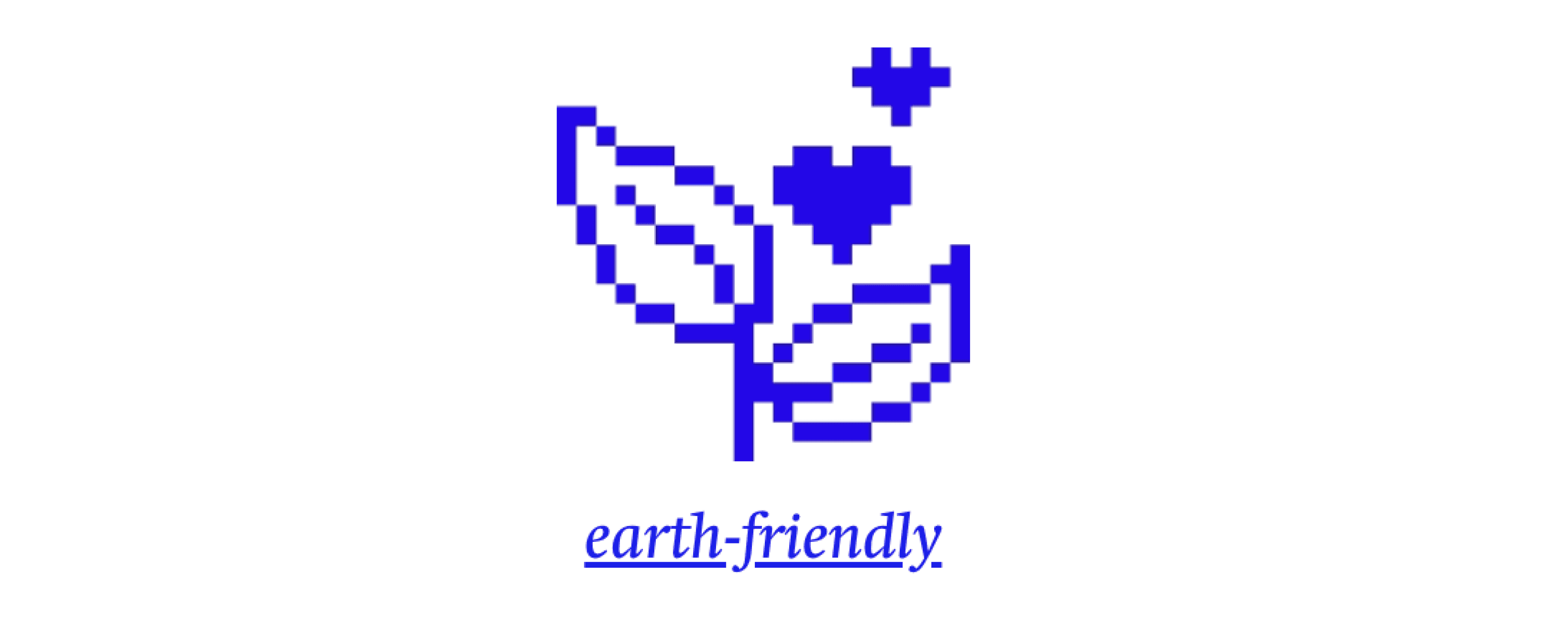


When I first visited the site, I actually clicked the text above thinking it was a link, which it is not. I would imagine a lot of true links are glossed over as a result as well. Here are some of the ways in which true links are presented on LorTush.com...
When I first visited the site, I actually clicked the text above thinking it was a link, which it is not. I would imagine a lot of true links are glossed over as a result as well. Here are some of the ways in which true links are presented on LorTush.com...
When I first visited the site, I actually clicked the text above thinking it was a link, which it is not. I would imagine a lot of true links are glossed over as a result as well. Here are some of the ways in which true links are presented on LorTush.com...


As you can see here, linked content is underlined, and some unlinked content is underlined. There are also a few ways in which linked content is presented. It’s critical to give a consistent means of indicating how an element functions in order to reduce what is referred to as cognitive load for the user. The more cognitive function required to operate a website/app, the more likely a user is to become overwhelmed and move on to a different task.
As you can see here, linked content is underlined, and some unlinked content is underlined. There are also a few ways in which linked content is presented. It’s critical to give a consistent means of indicating how an element functions in order to reduce what is referred to as cognitive load for the user. The more cognitive function required to operate a website/app, the more likely a user is to become overwhelmed and move on to a different task.
As you can see here, linked content is underlined, and some unlinked content is underlined. There are also a few ways in which linked content is presented. It’s critical to give a consistent means of indicating how an element functions in order to reduce what is referred to as cognitive load for the user. The more cognitive function required to operate a website/app, the more likely a user is to become overwhelmed and move on to a different task.
Solution
Solution
Solution
One solution here is to change the styles of underlining. For example, you could use a dashed or dotted underline for non-link text you want to emphasize, or underline it, except with different thickness, spacing, and color than seen in true linked text. One could also use the text weight (boldness) or color to indicate what text is linked and which isn’t.
One solution here is to change the styles of underlining. For example, you could use a dashed or dotted underline for non-link text you want to emphasize, or underline it, except with different thickness, spacing, and color than seen in true linked text. One could also use the text weight (boldness) or color to indicate what text is linked and which isn’t.
One solution here is to change the styles of underlining. For example, you could use a dashed or dotted underline for non-link text you want to emphasize, or underline it, except with different thickness, spacing, and color than seen in true linked text. One could also use the text weight (boldness) or color to indicate what text is linked and which isn’t.
Robust WCAG criteria
Robust WCAG criteria
Robust WCAG criteria
Essential failures
Essential failures
Essential failures
4.1.2: Name, Role, Value
4.1.2: Name, Role, Value
4.1.2: Name, Role, Value
4.1.2: Name, Role, Value
4.1.2: Name, Role, Value
4.1.2: Name, Role, Value
This level A criterion requires that for all user interface components, the name, role and value are available to assistive technologies. This means that the code properly applies names to elements, properly assigns roles to elements, and also the current state and setting of user inputted info is made available to the user.
This level A criterion requires that for all user interface components, the name, role and value are available to assistive technologies. This means that the code properly applies names to elements, properly assigns roles to elements, and also the current state and setting of user inputted info is made available to the user.
This level A criterion requires that for all user interface components, the name, role and value are available to assistive technologies. This means that the code properly applies names to elements, properly assigns roles to elements, and also the current state and setting of user inputted info is made available to the user.
This website fails this criterion for a number of reasons. In terms of names, there are no efforts to insert alt-text so that blind users get a description of images/animations. This becomes especially problematic considering the product is relying heavily on visual cues to present their brand messaging. There are also a number of images of text with no alt-text.
This website fails this criterion for a number of reasons. In terms of names, there are no efforts to insert alt-text so that blind users get a description of images/animations. This becomes especially problematic considering the product is relying heavily on visual cues to present their brand messaging. There are also a number of images of text with no alt-text.
This website fails this criterion for a number of reasons. In terms of names, there are no efforts to insert alt-text so that blind users get a description of images/animations. This becomes especially problematic considering the product is relying heavily on visual cues to present their brand messaging. There are also a number of images of text with no alt-text.
For role, as mentioned earlier, this site nearly entirely lacks semantic HTML- and role plays heavily into the practice of semantic HTML. <div> blocks and <span> elements are both HTML roles which, when overused, prevent a website from being accessible to users with screen readers. In the case of this website, it prevents assistive technology from recognizing the interactive elements on website. AXE DevTools detected no interactive elements when scanning the homepage, and this is what the elements looked like in code once I selected them manually…
For role, as mentioned earlier, this site nearly entirely lacks semantic HTML- and role plays heavily into the practice of semantic HTML. <div> blocks and <span> elements are both HTML roles which, when overused, prevent a website from being accessible to users with screen readers. In the case of this website, it prevents assistive technology from recognizing the interactive elements on website. AXE DevTools detected no interactive elements when scanning the homepage, and this is what the elements looked like in code once I selected them manually…
For role, as mentioned earlier, this site nearly entirely lacks semantic HTML- and role plays heavily into the practice of semantic HTML. <div> blocks and <span> elements are both HTML roles which, when overused, prevent a website from being accessible to users with screen readers. In the case of this website, it prevents assistive technology from recognizing the interactive elements on website. AXE DevTools detected no interactive elements when scanning the homepage, and this is what the elements looked like in code once I selected them manually…
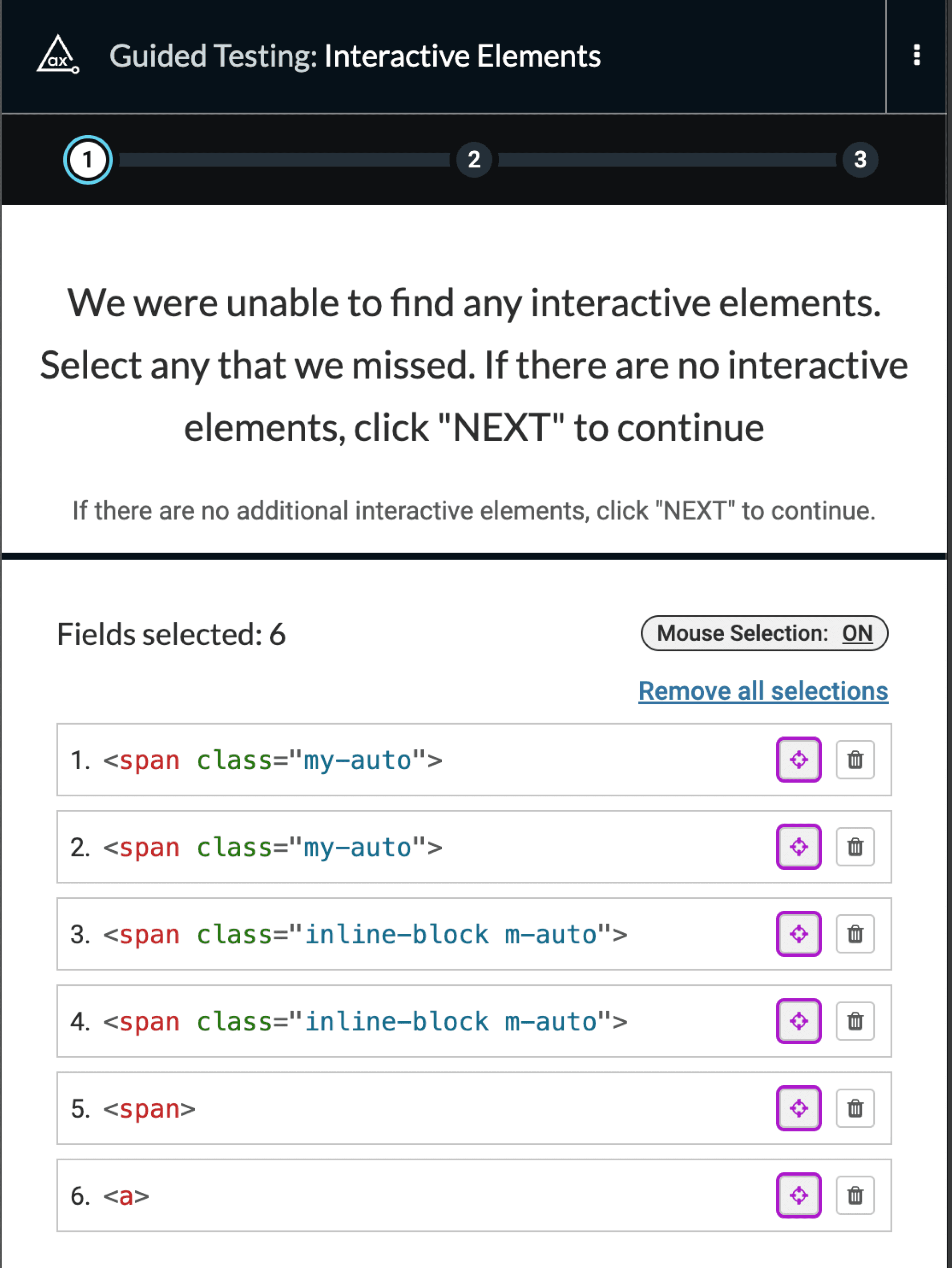


In terms of the “value” component of this criterion, I noticed one failure, although it was a significant one. Screen readers users are not notified when an item is added to their shopping cart, requiring a change of focus in order to confirm the addition.
In terms of the “value” component of this criterion, I noticed one failure, although it was a significant one. Screen readers users are not notified when an item is added to their shopping cart, requiring a change of focus in order to confirm the addition.
In terms of the “value” component of this criterion, I noticed one failure, although it was a significant one. Screen readers users are not notified when an item is added to their shopping cart, requiring a change of focus in order to confirm the addition.
Solution
Solution
Solution
The first step here would be replacing all <span> and <div> tags with semantically meaningful ones, or, less optimally, adding ARIA to certain span and div content in order to provide screen readers with semantic information. I’ve never used Shopify, but I would imagine what happened here is the drag and drop build interface favored <span> and <div> tags for the sake of simplicity, and for that reason every interactive element here ended up using a <span> tag. Ultimately, just replacing <span> with an anchor (<a>) tag should allow screen readers to recognize these interactive elements. Next, alt-text needs to be added to all important images on the website. Alt-text is descriptive text added to the code so blind users get information about images. For a product which heavily relies upon imagery to communicate brand messaging, there needs to be much more alt-text here.
The first step here would be replacing all <span> and <div> tags with semantically meaningful ones, or, less optimally, adding ARIA to certain span and div content in order to provide screen readers with semantic information. I’ve never used Shopify, but I would imagine what happened here is the drag and drop build interface favored <span> and <div> tags for the sake of simplicity, and for that reason every interactive element here ended up using a <span> tag. Ultimately, just replacing <span> with an anchor (<a>) tag should allow screen readers to recognize these interactive elements. Next, alt-text needs to be added to all important images on the website. Alt-text is descriptive text added to the code so blind users get information about images. For a product which heavily relies upon imagery to communicate brand messaging, there needs to be much more alt-text here.
The first step here would be replacing all <span> and <div> tags with semantically meaningful ones, or, less optimally, adding ARIA to certain span and div content in order to provide screen readers with semantic information. I’ve never used Shopify, but I would imagine what happened here is the drag and drop build interface favored <span> and <div> tags for the sake of simplicity, and for that reason every interactive element here ended up using a <span> tag. Ultimately, just replacing <span> with an anchor (<a>) tag should allow screen readers to recognize these interactive elements. Next, alt-text needs to be added to all important images on the website. Alt-text is descriptive text added to the code so blind users get information about images. For a product which heavily relies upon imagery to communicate brand messaging, there needs to be much more alt-text here.

End Result
End Result
End Result
While we completed the audit phase, we did not proceed to remediation. It became apparent that the client underestimated the level of potential complexity in digital accessibility, which is understandable. Given that this website is one of multiple projects for the client, they chose to prioritize other ventures over remediating LorTush.com.
While we completed the audit phase, we did not proceed to remediation. It became apparent that the client underestimated the level of potential complexity in digital accessibility, which is understandable. Given that this website is one of multiple projects for the client, they chose to prioritize other ventures over remediating LorTush.com.
While we completed the audit phase, we did not proceed to remediation. It became apparent that the client underestimated the level of potential complexity in digital accessibility, which is understandable. Given that this website is one of multiple projects for the client, they chose to prioritize other ventures over remediating LorTush.com.
To accommodate their circumstances, I referred the client to some accessible Shopify themes, in addition to suggesting a few key aspects of accessibility to focus on moving forward. This experience reinforces a known truth in the accessibility field:
To accommodate their circumstances, I referred the client to some accessible Shopify themes, in addition to suggesting a few key aspects of accessibility to focus on moving forward. This experience reinforces a known truth in the accessibility field:
To accommodate their circumstances, I referred the client to some accessible Shopify themes, in addition to suggesting a few key aspects of accessibility to focus on moving forward. This experience reinforces a known truth in the accessibility field:
It is exponentially more expensive to remediate accessibility problems after the fact than it is to consider these issues from the beginning while designing and building a product.
It is exponentially more expensive to remediate accessibility problems after the fact than it is to consider these issues from the beginning while designing and building a product.
It is exponentially more expensive to remediate accessibility problems after the fact than it is to consider these issues from the beginning while designing and building a product.
